Dear Nike,
I know that you're/we're all excited about having won the contract to outfit the NFL. It's about time, if you ask me. For crying out loud, about 70% of the NFL players wear Nike already! I know you're going to be incredibly successful with the league and the extra business and exposure will be huge. But like Uncle Ben said, "with great power, comes great responsibility."
It's pretty obvious that Reebok worked themselves out of the NFL with poor design and average quality. This presents a huge opportunity but also a big responsibility for Nike. As a fan of the game and of the way it looks, and as a Nike retailer, I feel that there are things that need to be done and others that need to be undone with the changing of the guard. Unfortunately, I have no control over any of that in my position. I only have hope, hope that Nike will restore the professional look the NFL once had and intelligently blend it with all the fun and forward-thinking innovations that Nike has to offer.
Here are my specific wishes for the NFL/Nike marriage come April 2012...
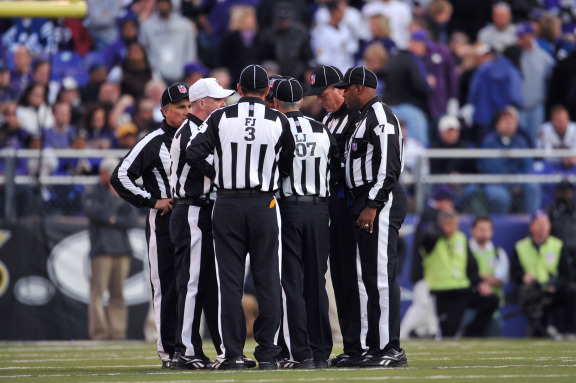
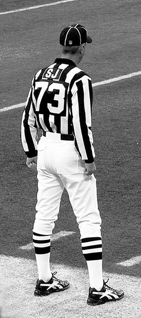
1) RESTORE RESPECTABLE LOOKING REFEREES
It all starts with the refs. If the game is to be respected, then those responsible for its efficient operation must be respectable. Right now, they look anything but respectable. Are those truncated jersey stripes?! And wait, slacks?! With a stripe?! Oh boy. I could go on (numbers on the back, black sleeves...), but you get the idea. My point is, it looks amateurish. All of Reebok's redesigns do (we'll get to that in a minute). This look is the product of saying, "hey, let's update it a bit," without putting any effort into maintaining all the visual brand equity NFL referees had built up over the years as football and the corresponding media coverage has grown exponentially. The current uniform looks like it belongs in a European semi-pro league or on the field during a Saturday youth football game.
Simply put, we need to get back to this. Simple, classic, and instantly recognizable, with knickers and striped socks at all times! It just looks better, like a respectable NFL referee. And if a referee looks respectable, then we can respect their decisions.
2) UNIFORM UNIFORMS
It's a novel idea, I know. Uniforms that look the same. It would appear that the word uni- (one) -form (form), would limit extreme variation from the same group meant to wear one. However, Reebok has shown that it is a much more difficult task than one would assume. Let's take a look at some examples...
-Bengals
-Seahawks
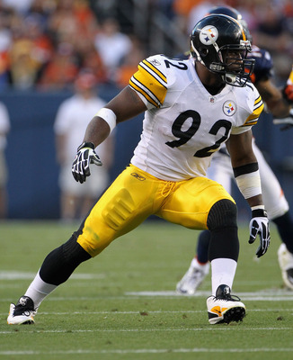
-Steelers: Harrison vs. Woodley
-Broncos: Tebow vs. his linemen
-Jaguars: Gabbert vs. Jones-Drew
-Packers: Rogers vs. Driver
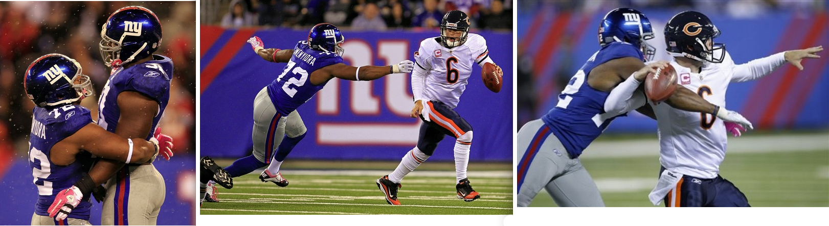
-Giants: Manning vs. Boss
This is just embarrassing. What encourages me is that you've been able to pull off uniformity across position-specific tailorings for your collegiate teams, most obviously Iowa. Every detail is the same, it's only the size that's different. This is what needs to happen and it's really not that hard.
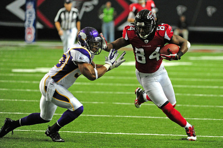
There's also a phenomenon that happens across the NFL, even on teams without drastic stripes or designs, in which different players wear different jersey templates. Sometimes, different players wear entirely different fabrics which alter the look of the jersey significantly. Ultimately this is a different jersey, which flies right in the face of the definition of uniform.
Please Nike, make uniforms uniform again.
3) RESPECTABLE DESIGNS
When Reebok took over ten years ago, there wasn't a whole lot of variety in NFL uniforms. It was a whole lot of stripes and not a lot of difference in templates. As teams wanted to update their look to follow in the footsteps of the Broncos, Buccaneers, and Patriots, Reebok had a significantly blank slate to change the visual identity of the logos and uniforms of some very visible teams around the league.
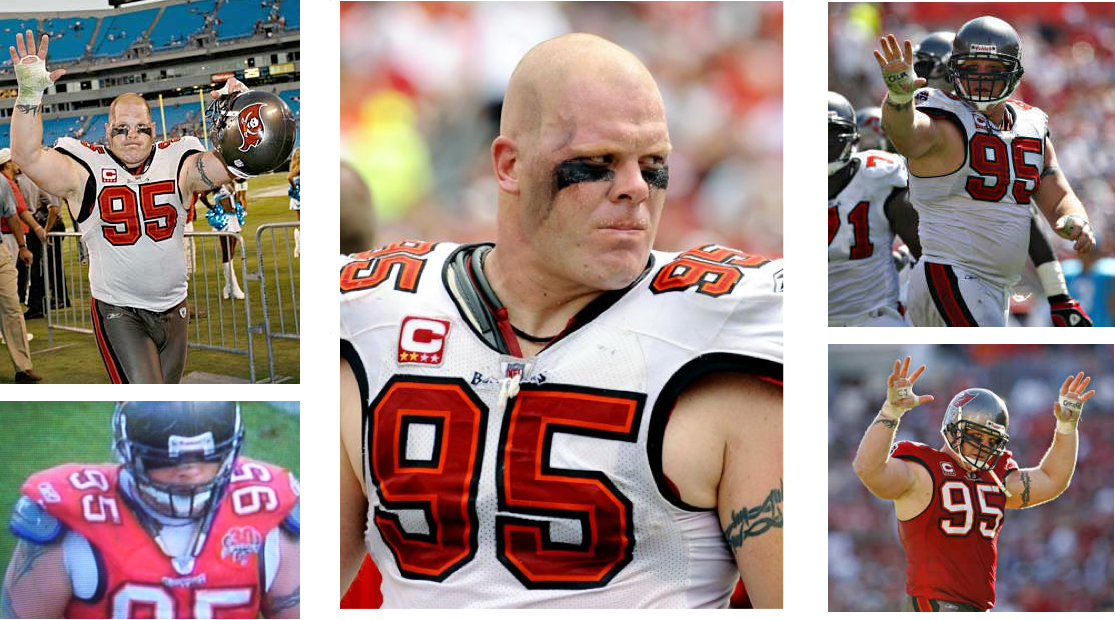
But that's where Reebok went wrong. In my opinion, Reebok's footwear design started going downhill in the early 2000s and the NFL teams that got an overhaul around that time and since were victims as well. Some of the casualties include the Bills, Cardinals, Vikings, Falcons, Chargers, and Jaguars. I won't get into why those uniforms are complete failures, as I believe they speak for themselves. To be fair, Reebok did OK with a few redesigns. Some (the Lions, Texans, 49ers, and the Bills' second go around) were better than others (Bengals). And this may be a surprise to some, but I still hold that Seattle's redesign was one of Reebok's few (if only) successes. But when most of your unique redesigns are that bad, it's not the kind of legacy you want to leave behind.
Even in Reebok's successes, they managed to make simple mistakes that ruined what could've been a flawless design. I'm thinking of things like the 49ers' sleeve stripes. What happened there? I understand that many players have minimal seeves, but even those guys have space to put all three stripes around the sleeve. They're actually designed to interfere with the sleeve cuff. Silliness. Amateurism. These are simple mistakes that didn't have to be made. Please rectify this!
So when the time comes to overhaul some teams, please do it tastefully. I know the team has the ultimate say, but let's remember that some teams said yes. The power will be in your hands once in a while, so please use it wisely. And if at all possible, please usher some of those teams more in need to the front of the redesign queue.
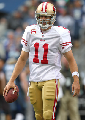
4) JERSEYS, NOT TANK TOPS
This is not a football jersey. Neither are these. Please show the pros what collegians have already learned: jerseys can be sleek and ungrabbable while still covering and protecting your body.
5) UPDATE GRAPHIC IDENTITIES
I think we can all agree that these facemasks don't exist anymore. So why is an image of it still used so frequently and so prominently? The NFL and its players are very picky and specific about their equipment, so there's no reason that one of the ugliest and most antiquated helmets in football's history needs to be used in any kind of NFL art or a team's graphic identity. You guys are an intelligent and creative design house. If anyone can show the Browns and the NFL that you can be successfully plain and traditional without being obsolete, it's you guys.
6) BRING IT ALL TO RETAIL!
Again, the idea is simple: people want to wear what the pros wear. But let's be honest, this is not what he wears. Sure, some people like their jersey to look like pajamas. But there are others of us that want to wear what the pros actually wear. It doesn't have to be at every corner shop, but just make it available, even if it's just on websites (nike.com, nfl.com, team websites, etc.). Trust me, there are people out there who will buy it.
And that Cardinals jersey linked above brings up another frustration of mine. Let's clarify, or at least adhere to the meaning of "Authentic." When I was a kid in the 90s, products labeled as "Authentic" were what the pros actually wore. You could see it on the TV on Sundays. Nowadays, "Authentic" looks like this. Don't lie to consumers, we're smarter than you think.
Now, please don't read this and think that I'm not excited to see you, Nike, take over as the NFL's outfitter. I'm simply nervous and apprehensive after having seen what kind of damage can be done when a company that is ill-prepared gets stretched too far. But I have full faith that you'll do it and do it right. My intent here is just to make sure the voice of the NFL fan is heard to make this endeavor as amazing as it can be.
Here's to the next ten years!
Yours in NFL Fandom,
Greg Riffenburgh
Subscribe to:
Post Comments (Atom)

Well done Greg! I clicked on every picture. Interesting info! As soon as I can figure out how to do it, I'll add you to my blog roll on http://whatagirleats.com/
ReplyDeleteAs a football official, albeit on the high school level, I must object to the white knickers for officials (please don't call them all referees - I earned my white hat after 16 years of being a linesman and back judge) "at all times". I have thrown away several pairs of white knickers and NCAA-striped socks over the years, and they are not exactly inexpensive. It befuddled me: baseball umpires work in (necessarily) relatively good weather, and wear grey trousers; basketball officials work indoors and wear black trousers; hockey officials are on ice and wear black trousers. Why on earth did we, who have to work in all types of inclement weather, have to be the ones who wore white?
ReplyDeleteWe now wear the black trousers, which repel water and mud, as well as help to keep one warm in the colder months. I would be happy to compromise, wearing white knickers only when conditions allow.
Great article, otherwise!
Totally agree regarding #4, but it looks like an alteration the team or player performed themselves. I doubt Reebok delivered the jersey looking that way.
ReplyDeleteAs a High School and College football official, the time for white knickers is gone. Black pants with a white strip are great. I do agree that the NFL officials need to go back to the 2" stripes that college officials began wearing this season.
ReplyDelete